Add Maple

Likert Scale Chart Creator

Select your raw data file (csv, xlsx, json or sav) and we'll generate instant likert scale charts

Greenpeace InternationalStanford UniversityBerkeleyCornell UniversityHarvardUniversity of Texas at Austin

We turn your data into interactive likert scale charts in seconds

Creating likert (opinion) scale charts can be a real pain in spreadsheets. This tool will create beautiful, interactive likert scale charts from your raw data in seconds.

Our tool works with raw data, e.g. your raw survey responses. Simply click the button above, and select your data file (CSV works best, but we also support XLSX and SAV). We'll load your data, analyze it and present an interactive dashboard with your likert scale charts.

Select a chart to expand, adjust and share. You can download the chart or share via a unique url.

Create Likert Scale Charts Online

likert scale charts

Save hours! Save tears!

No more file formatting and file preparation - we handle that for you. No need for complicated spreadsheet functions. Get instant interactive Likert Scale charts with AddMaple.

AI Powered Chart Interpretation, Text Summaries & Thematic Coding

AI Powered Data Exploration

Save hours with AI. Spend less time cleaning and preparing data and more time analyzing and gleaning insights. Get a visualized dashboard to kickstart your data exploration. Use AI to summarize and code free text data and to interpret graphs in everyday language.

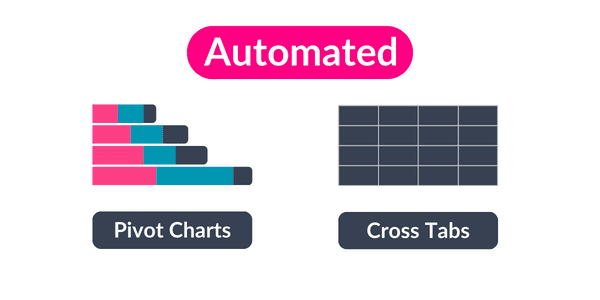
Automated pivot charts and cross tabs

Export or Share

Are you still manually pivoting data to summarize it? Turn each column into summarized tables and charts instead. Get calculated data tables for multiple columns in seconds that you can share as a table or a chart. 

Watch Our Short Explainer

Simply AddMaple To Your Data - Sweet!

AddMaple has reimagined data exploration using programming genius, the latest in-browser tech and of course AI to give you a data analysis tool that is truly modern and insanely fast.

We automate the data prep, formatting, cleaning and aggregation so that you can skip straight to insights.

Give AddMaple a raw dataset and it will turn your columns into summarized explorable charts instantly. From their you can segment, view cross-tabs, get column stats and more.

Visual-First, Code-Free Exploration

AddMaple's visual-first approach allows you to start analyzing data without the need to write complex code or formulas. With AddMaple, you can swiftly explore various columns and identify relationships in your data through interactive visualizations. Add pivots, segment or get AI-generated summaries.

Likert?

The Likert scale, a widely recognized method in survey research, provides a simple yet effective way to gauge opinions and attitudes. Our Likert Scale Chart Creator is designed to enhance this experience, offering an intuitive platform for generating clear, precise Likert scale questions. Whether you're conducting a satisfaction survey, gauging employee sentiment, or gathering market research data, our tool ensures your questions are structured effectively to elicit meaningful responses.

Benefits of Likert Scale Questions

Likert scale questions, ranging from 5-point agree scales to 7-point satisfaction measures, are indispensable for capturing nuanced feedback. They offer a balanced range of options, from 'strongly agree' to 'strongly disagree', making them ideal for capturing the intensity of respondents' feelings. This format encourages more thoughtful responses, leading to richer, more actionable insights whether in customer feedback, employee surveys, or academic research.

Advantages of Neutral-Aligned Charts

Our Likert Scale Chart Creator simplifies what can be a complex task in standard spreadsheets: creating neutral-aligned charts for Likert scale responses. By aligning responses on a horizontal stacked bar chart with a central point through the neutral area, the tool provides a straightforward and clear visual comparison of positive versus negative views for each question. This method is particularly effective for quickly visualizing and comparing the balance of opinions, allowing for an efficient analysis of data that might otherwise be challenging to achieve in typical spreadsheet applications.

Interactive Charting for Enhanced Analysis

Interactive charts are at the core of our tool, offering a dynamic way to visualize and analyze Likert scale data. These charts not only present the distribution of responses in an easily digestible format but also allow for in-depth analysis through features like real-time filtering and segmentation. This makes it easier to identify trends, compare different demographic groups, and draw meaningful conclusions from your Likert scale survey data.

Try it now

Our Likert Scale Chart Creator is designed to offer a practical solution for visualizing Likert scale survey data. Focusing on functionality, it takes raw data to interactive chart in seconds. Something that is cumbersome in traditional spreadsheet tools. This approach allows for a straightforward interpretation of survey results, helping users to quickly discern trends and sentiments from their data. It's a straightforward, easy to use tool aimed at simplifying the process of analyzing Likert scale responses.

Frequently Asked Questions

What people say