Firstly, here’s a 🥳 for getting your survey out there and responded to. Now let's get it analyzed.
1. Get an overview of ALL your data in one easy step
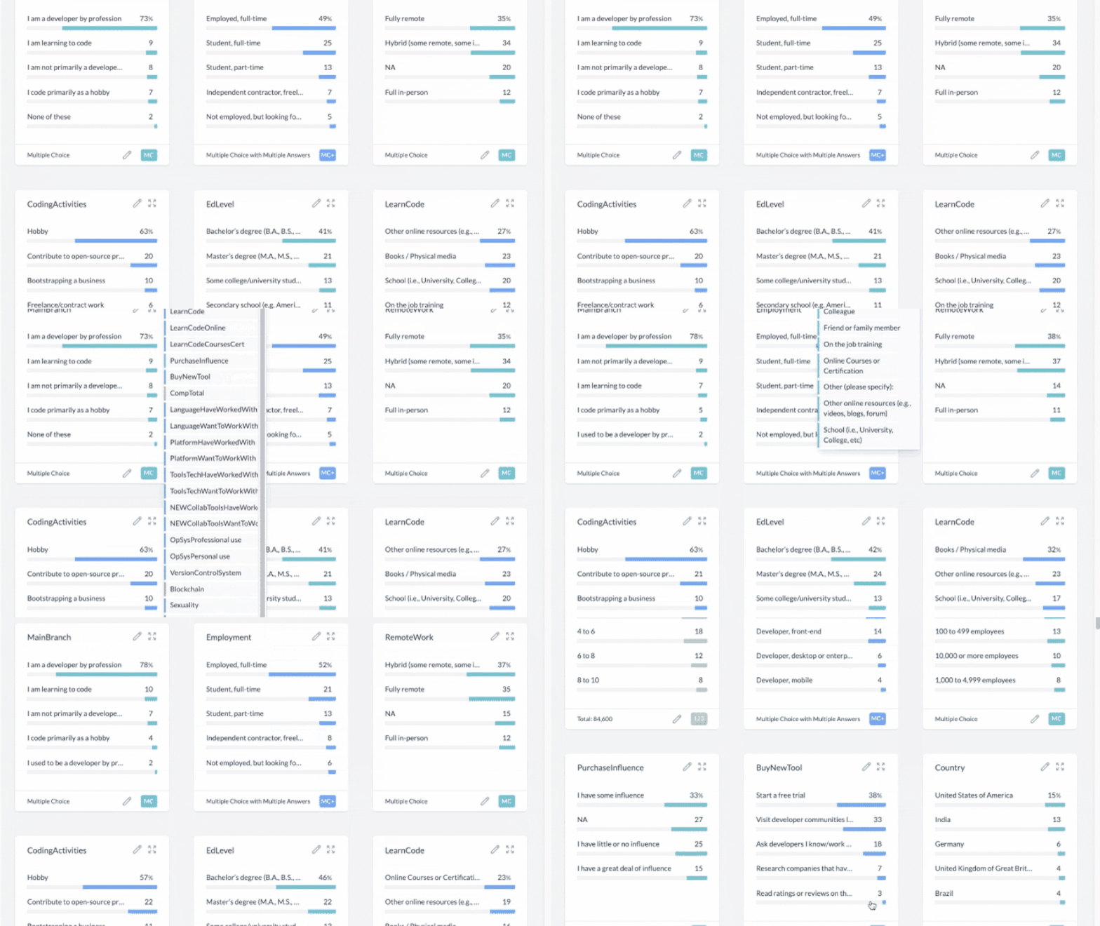
When AddMaple reads your data file in your browser, it will automatically show you a graph summary page of ALL your data. That means all your columns will be analyzed and visualized as graphs in seconds. This happens automatically, you don’t need to do anything other than give AddMaple read-only permission. The column order from your raw data from left to right, will be represented in the same order on the graph summary from top to bottom.
How to give AddMaple read-only permission:
- Click on New Project and select the raw data file you want to analyze.
- Don't worry about cleaning the data or configuring it. AddMaple will do that for you.
2. Toggle between viewing data in graphs, a table or as reader-friendly row-by-row entries
Use the top left "VIEW DATASET AS" menu to toggle between graphs, table and rows.
Read on below for further details on how the graph, table and row-by-row pages work to help you analyze your data.
3. Your data in graphs. Add filters, pivots and edit column titles/types.
See all your data in graphs that you can interact with:
AddMaple automatically creates graphs from your data without you needing to clean the data or format it. This is done in seconds in your browser.
Watch the tutorial video below showing you how to do the following:
- Edit long column titles and column types [video timestamp 0:05 - 0:23]
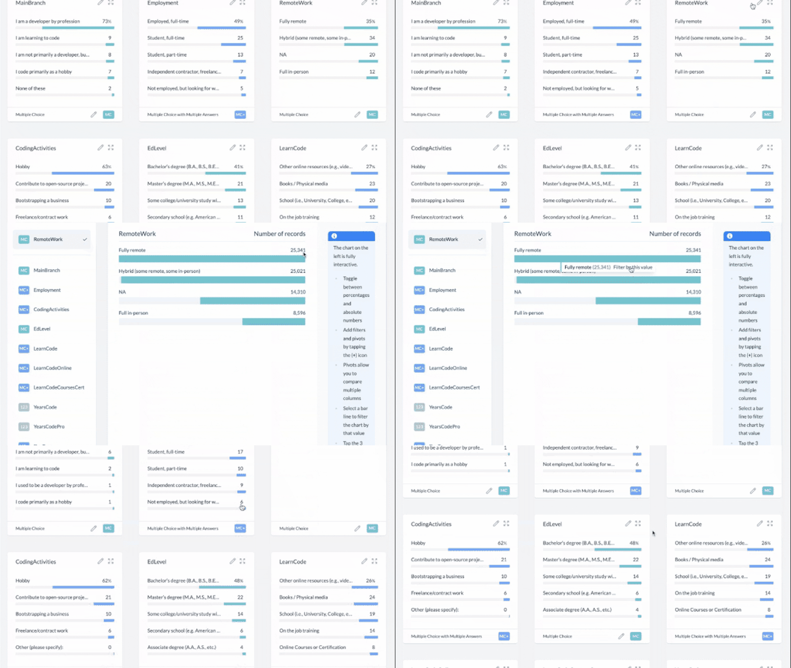
- Expand a graph to see it in full [0:23]
- Filter by a bar in a graph. You must expand the graph first for this feature [0:28]
- Pivot your data in 3 easy steps [0:40]. Read on to see the 3 steps broken down clearly.
An example pivot with step-by-step instructions
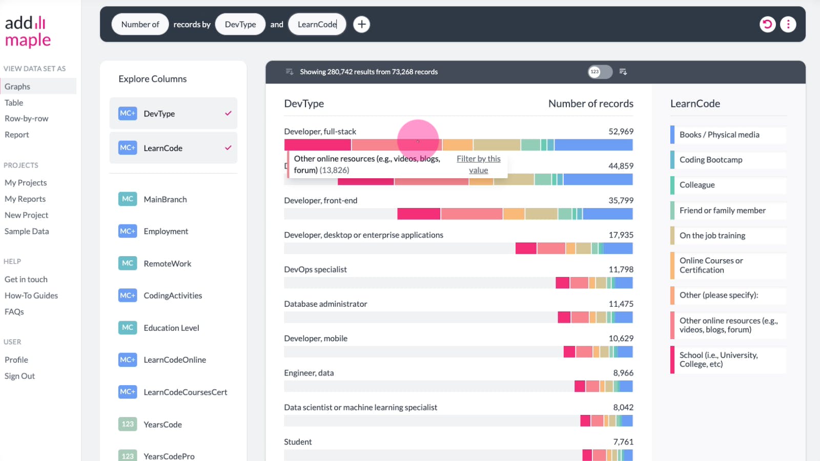
- In this pivot example above we want to know how the different types of developers (full stack, front end, mobile etc) in our dataset learned to code.
- This dataset contains 73,268 responses.
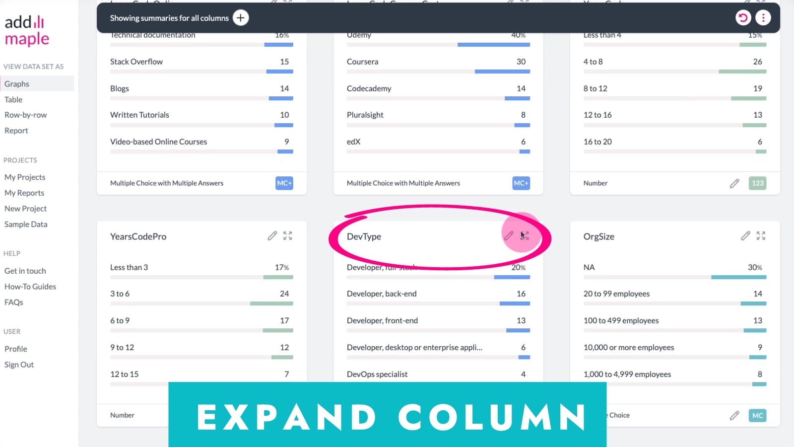
- The column containing the type of developers is titled "DevType". This is the column we want to pivot which is why we expand it first.
- The column containing the pivot criteria, how the developers learned to code is titled "LearnCode".
- You can easily swap the pivot parameters with each other, thereby swapping which column pivots the data. Swap these by clicking on the existing pivoted columns in the black sentence bar, and select the first "swap" option.
Expand the graph you would like to add pivots to. In our example this is the type of developer column, "DevType".
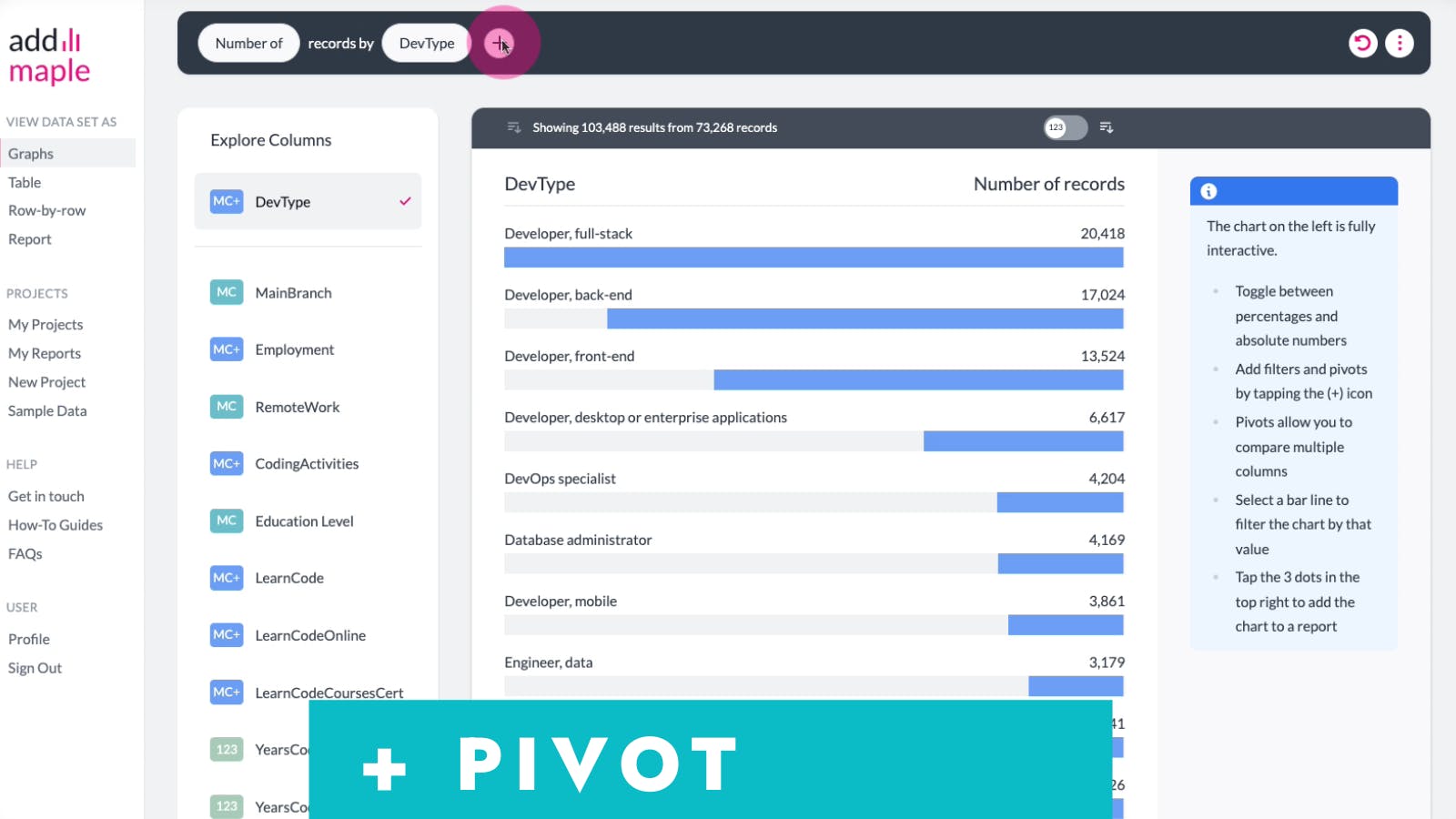
Use the + icon to add a pivot to the expanded graph. You can add filters via the + icon too.
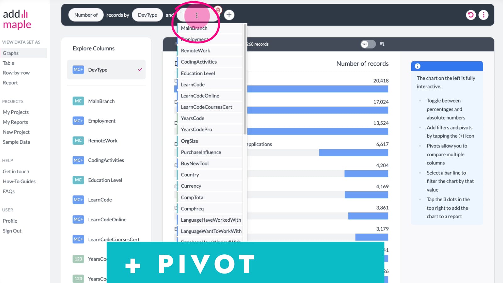
Select the column you would like to pivot your data by, which in our example is "LearnCode".
Voila. Your pivot graph is produced. You can now add filters by hovering on segments you'd like to filter by. Or you could share your graph, or add it to your report as we explain below.
You can easily swap the pivot columns thus swapping the column being pivoted (sliced in segments) with the column applying the pivoting. Below we pivot the type of developer column with how they learned to code. And then we swap these two around, to look at how developers learned to code by the type of development work they do.
This is the pivoted graph we produced in our example. Next we want to swap the "DevType" and "LearnCode" columns.
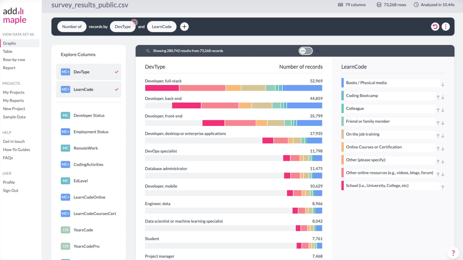
Click on either of the columns in the black box. Then click on the first option in the drop down menu which reads, "Swap with ...". That's all you need to do. Done.
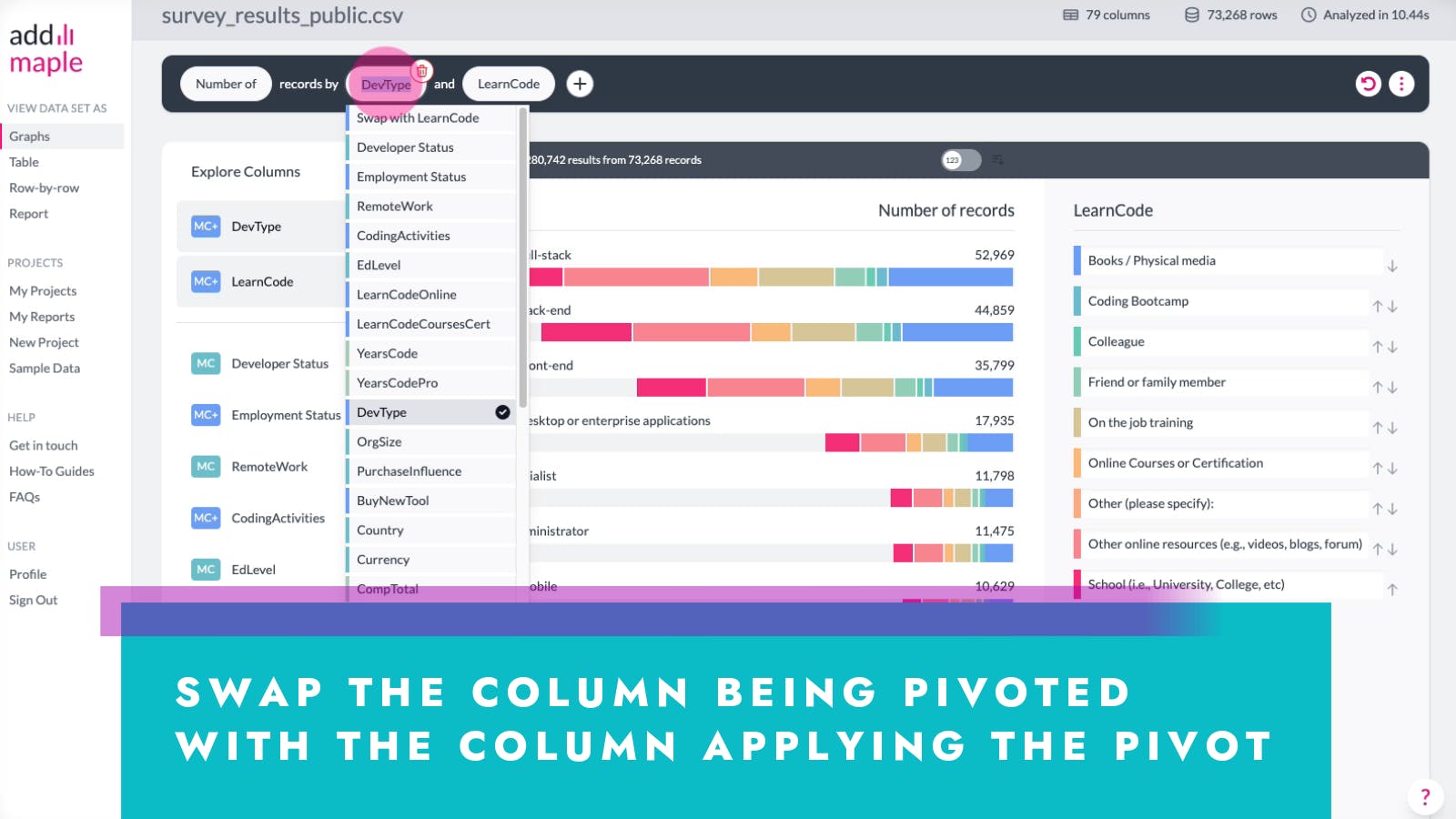
You're now looking at the LearnCode column pivoted by DevType.
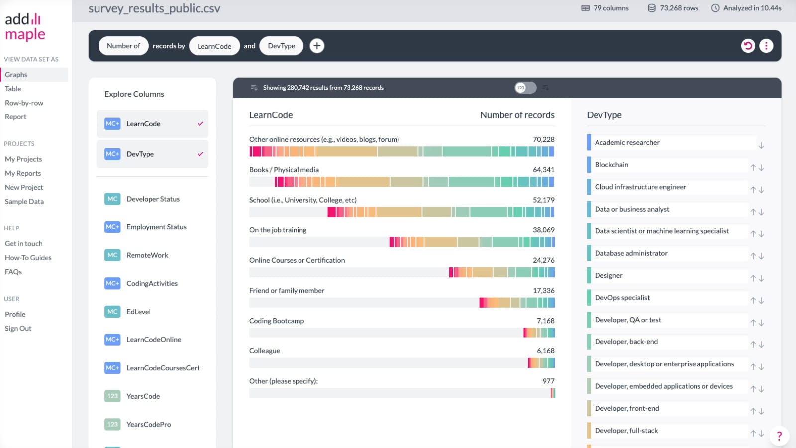
Add interactive graphs to your report using the three dotted vertical ellipsis menu at the top right of the black box.
4. Your data in tables. Add filters, select columns, expand on individual data rows.
Our tables aren't just static presentations of your data. They are interactive.
AddMaple turns any raw file into a table. But unlike Excel, we don't include all columns and overwhelm you with information. We allow you to select and deselect which columns you need in your table.
Watch the tutorial video below showing you how to do the following:
- Add columns [timestamp 0:04 - 0:12]. Select columns to add to your table by clicking on them.
- Sort columns [0:15]. Use the sort icon.
- Remove columns [0:17]. Simply click on any selected columns, to remove them from your table. Selected columns have a tick beside them.
- Segment your data [0:23]. Add Filters to your table using the top + icon in the top menu.
- Expand individual records [0:52] . If you see an interesting response in the table and want to read that record in full, click on the corresponding record number on the left. This brings up that record's row-by-row view where you can read free-text responses too. Here you can also see how that respondent's answers or that data record, compares to the overall data cohort you're looking at. Return to the table/graph view via the top left "View DataSet As menu".
Filter data by clicking on a response in your table
- Being able to filter by responses in a table is more intuitive.
- In the example video we click on "Master's degree" in the "EdLevel" column to add "Master's degree" as a filter. We then only see responses where candidates selected that option in their response.
- Then we add "Hybrid" from the "RemoteWork" column as a filter.
- You can specify whether you want to include or exclude the filtered results from your table. If you choose to exclude the filtered results, you won't see responses containing the filters you applied. The default is to include the applied filters as you see from the video.
Columns containing quantitive data (multiple choice questions, opinion scales etc) are automatically colour-coded. This helps you spot matching responses.
5. Your data in individual rows. Add filters, compare responses to cohort, filter by free-text
Reading individual records can help you understand the context of that specific record.
However, we show you how that record compares with the overall cohort, so that you can easily spot outliers. A deep dive with a helping of big picture perspective. This applies to survey data and other quantitive data. The free-text filters you can apply is probably one of the most useful aspects of the row-by-row view. This way you can only read records containing certain words to save time.
Watch the tutorial video below showing you how to do the following:
- See how an individual record compares with the overall cohort you're looking at [0:08]
- Add filters by clicking on a response in that record [0.28]. In the tutorial example, we filter by developers who learned to code using "Other online resources (e.g. videos, blogs, forums)" by clicking on that response.
- Switch between viewing individual records, graphs, table and report [0:36]
- Read free text responses and apply word filters [0:43]. This enables you only to read records including/excluding specific words
6. Watch a survey analysis video in full

7. Apply filters to your entire dataset in two simple ways
We learn so much from survey data, both when we look at the responses as a whole, and when we apply filters to look at how specific segments answer questions, in order to compare their responses with other segments. This is often where deeper insights hide from plain sight. From demographics to user preferences, opinions, work history and more, our filters are easy to apply and remove. We even allow you to segment your data by specific words a respondent included in their free text response if you included open-ended questions!
You could also add filters using the information provided by your survey tool, e.g. Survey Monkey. Data such as survey completion times (perhaps filter out possible rushed responses), or IP regions, completion time stamps (find the night owls) or even devices used to complete the survey (find those who do everything on their phone) and so on. Needless to say, the reasons Why it is useful to segment your data are so numerous, they deserve a dedicated article.
Right, here's how to apply filters to your data
Method 1: Filter by the top "+" button. Watch the video tutorial below.
*This top black menu box serves as a sentence builder where the applied filters and pivots are written in plain english.
- Tap the "+" icon
- Select "Add Filter"
- Select the column that you want to filter the data from
- Select whether to include or exclude the values you will apply next. You could remove a segment from the dataset or you could only view the data where those values are applied.
- The video tutorial below shows you how to segment your dataset by respondents who learned to code using online courses. With the filter applied, you can view every column graph automatically update with this applied segmentation filter.
This video tutorial shows you how to filter data using the "+" button found on the top menu
Method 2: Filter data directly from a bar in a chart
This method allows you to filter by the interesting metrics you see on a graph. Rather than decide up front what you want to filter by, this method allows you to filter by the interesting insights you see in the graphs themselves.
- Expand a graph you want to explore further.
- Hover over a bar in the graph (not the empty space) that you want to filter your data by. When you do this you will notice the following text appear, "filter data by this value" which you should click on.
- That's it.
- Note, that filtering a single-response Multiple Choice question (the teal MC questions) work slightly differently to the multiple-response Multiple Choice questions (the blue MC+ questions).
Single-response question filtering: Segment by one value OR other values.
Multiple- response question filtering: Segment by one value AND other options.
Clicking on a response to add a filter can also be done when you're in the table and individual row-by-row views.
This video tutorial shows you how to filter data directly from a bar in a graph
