There is a treasure trove of interesting data available from the Pew Research Center
From the American Trends Panel Datasets to surveys exploring how we interact and relate to technology.
Some Pew Research data is available for free (not their most recent datasets) but the catch is that they are only available in the .sav (spss) format. This format is designed for IBM SPSS software, which is expensive and hard to use. But fret not.
If you are keen to explore a SAV file, such as what you can get from Pew, but don't have IBM SPSS, then this guide is for you. We'll show you how to open, analyze, explore and create shareable charts and reports from Pew Research data in just a few clicks with AddMaple.
First things first, why should you use Pew Research data?
You might want to bolster your research portfolio, or use a report as a case study that requires you to have a reputable data source. Well, Pew Research Center is considered by many to be a trusted source for data measuring a broad range of issues, attitudes and trends shaping our world. It is a nonpartisan fact tank. Their research spans numerous topics, from politics and media to science and society. Their commitment to public service and open access means that many of their data sets are freely available for download. However, while the data is available, accessing its insights isn't always straightforward for the layperson. That's where AddMaple comes into play.
Step-by-Step Guide: From Download to Insight
1. Getting Your Pew Research Data:
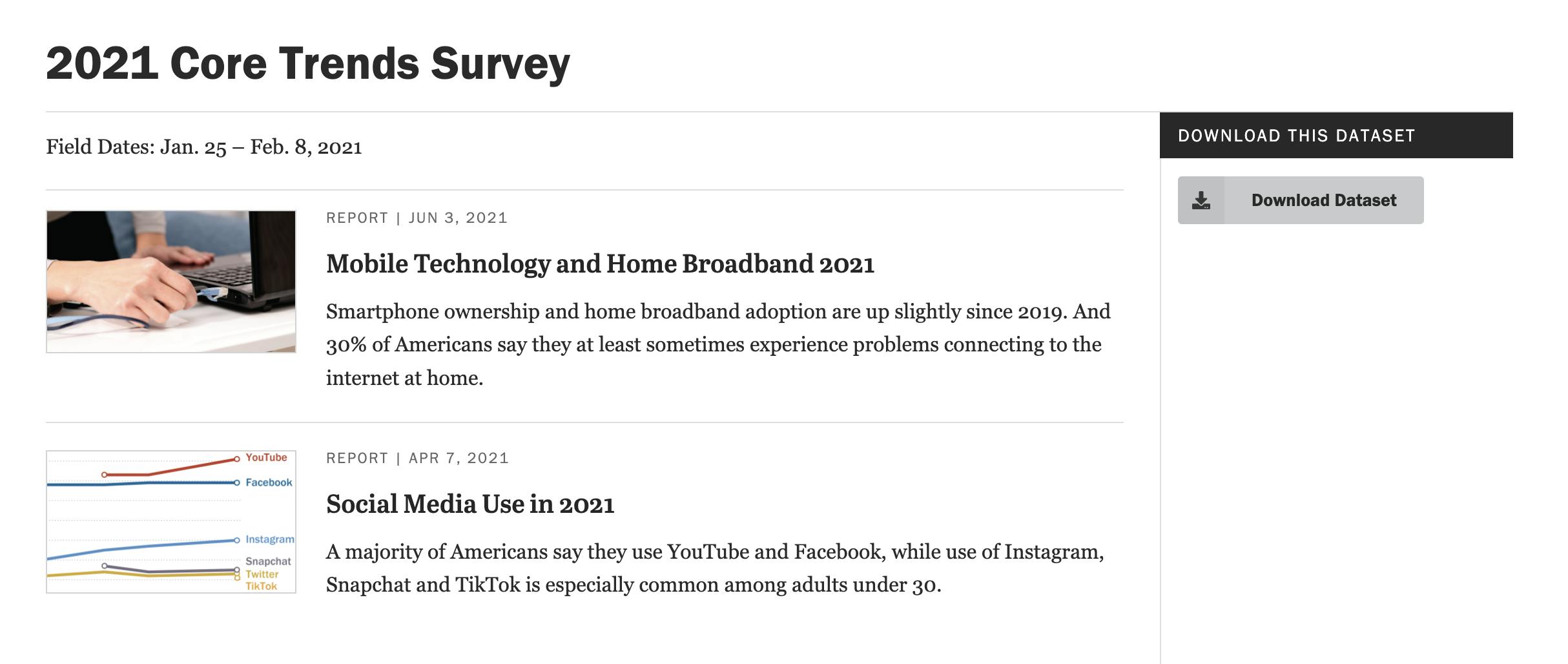
- Navigate to Pew Research's Data Download section
- Browse the available datasets and choose one that sparks your interest
- Download the .sav file to your computer
2. Launching AddMaple:
- Open AddMaple.com
- Sign in or create an account if you're a new user
3. Uploading Your Data:
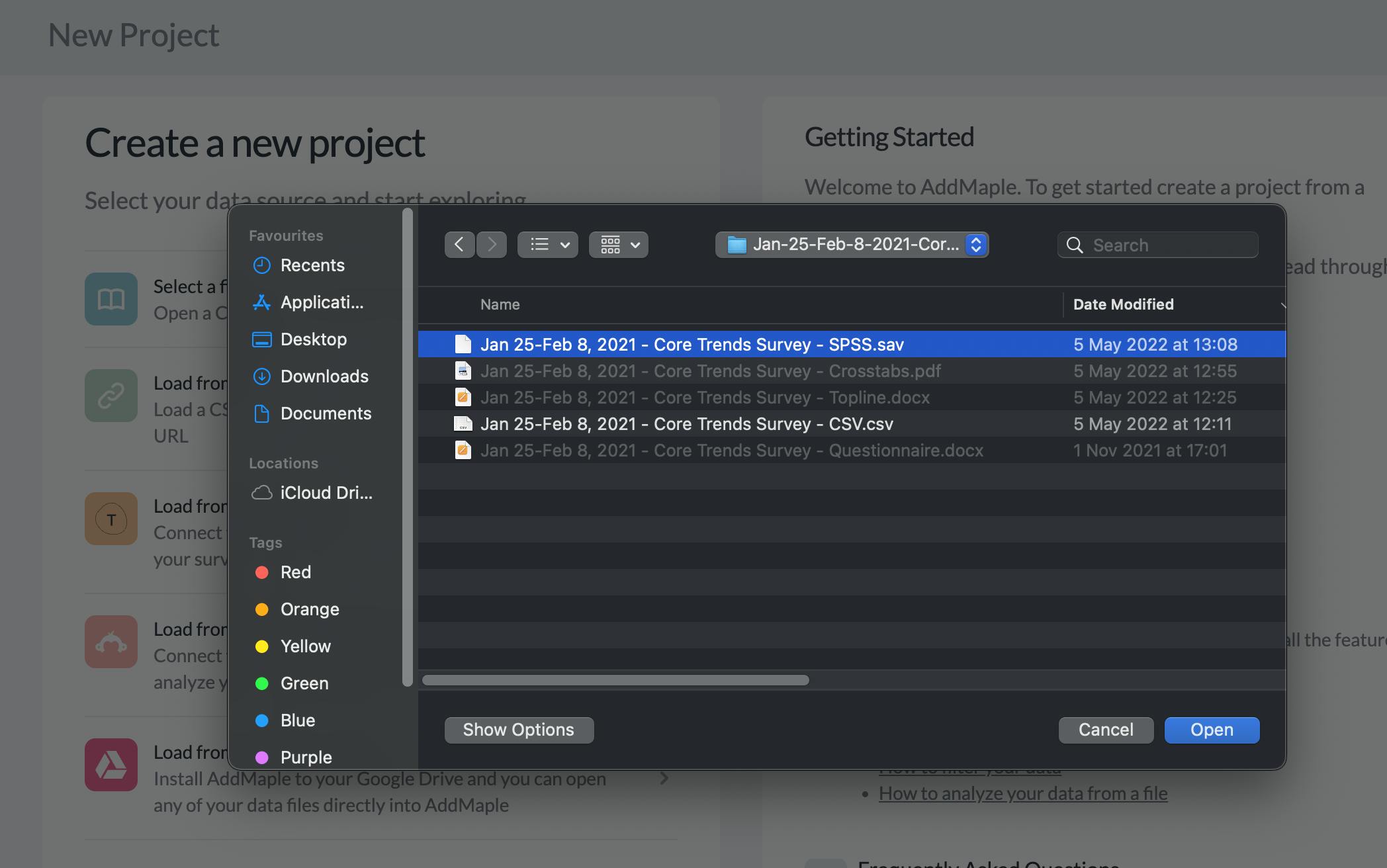
- In the AddMaple dashboard, select "New Project
- Select the .sav file you downloaded from Pew Research and let AddMaple work its magic
4. Exploring with AddMaple:
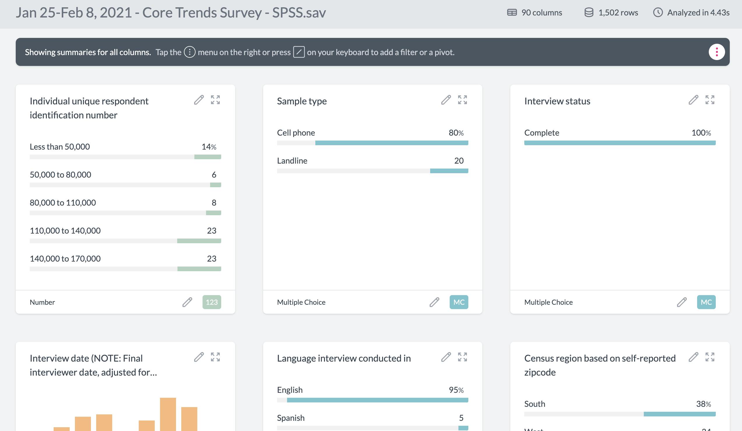
- Once uploaded, AddMaple will automatically detect the column types of your dataset
- Navigate through the provided summaries, charts, and visuals that AddMaple has created for you
- Customize and dig deeper into specific data points, filter information, or perform comparative analyses
5. Sharing and Collaborating:
- If you've found an intriguing insight or pattern, use AddMaple's sharing features to send your findings to colleagues or embed them in presentations. Or add them to a report you can publish with AddMaple.
Sharing Charts
Creating and sharing interesting charts is quick and intuitive in AddMaple.
For example, we downloaded the Jan 2021 Core Trends Survey from Pew and within a few clicks created an "Age vs Internet Usage" interactive chart.
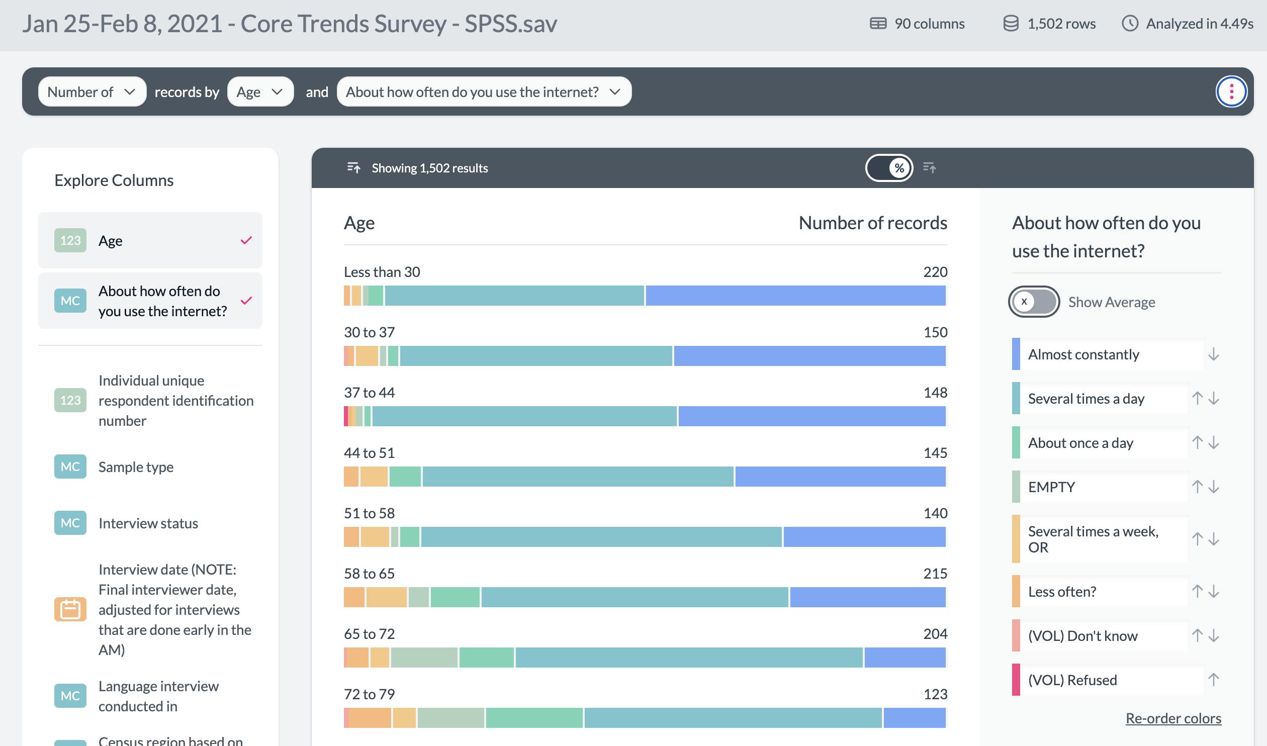
After creating the chart, we clicked "Share Chart" to get a sharable url to an interactive version of the chart.
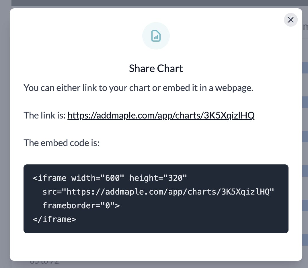
The link to the chart can be embedded in tools like Notion, or shared on Slack with automatic image previews.
Below is an actual embedded version of the interactive chart created above. Click on the kebab icon for interactive elements. Toggle between count view and percentage view.
We've only scratched the surface of the type of analysis that you can do in AddMaple.
For a more detailed guide to analyzing surveys, check out our full guide.


![[object Object]](/_next/image?url=https%3A%2F%2Fimages.prismic.io%2Faddmaple%2F21926831-e4c9-4bd9-b491-988c14ac8652_1_lr6FdpBKaqVcFZgW-0l_qQ.webp%3Fauto%3Dcompress%2Cformat%26rect%3D0%2C73%2C2000%2C853%26w%3D1200%26h%3D512&w=3840&q=75&dpl=dpl_DLd6xyNGPe6NhUQ5g4K3kf4a1ZYN)
![[object Object]](/_next/image?url=https%3A%2F%2Fimages.prismic.io%2Faddmaple%2F5400f536-12e2-4acd-ba3b-a489fc3465c2_Multi-part-streaming%2BHitra%2B%2B%25281200%2Bx%2B512%2Bpx%2529.png%3Fauto%3Dcompress%2Cformat%26rect%3D0%2C0%2C1200%2C512%26w%3D1200%26h%3D512&w=3840&q=75&dpl=dpl_DLd6xyNGPe6NhUQ5g4K3kf4a1ZYN)
![[object Object]](/_next/image?url=https%3A%2F%2Fimages.prismic.io%2Faddmaple%2FZgLuQMcYqOFdyF-t_YourGuideToThematicAnalysis.png%3Fauto%3Dformat%252Ccompress%26rect%3D0%252C0%252C1200%252C512%26w%3D1200%26h%3D512&w=3840&q=75&dpl=dpl_DLd6xyNGPe6NhUQ5g4K3kf4a1ZYN)